Case study — Sustainable Goods
Studio Verde: the build that paid for itself.
A campaign identity and packaging refresh for an eco goods brand — editorial posters, a modular label system and print collateral retail buyers photographed.
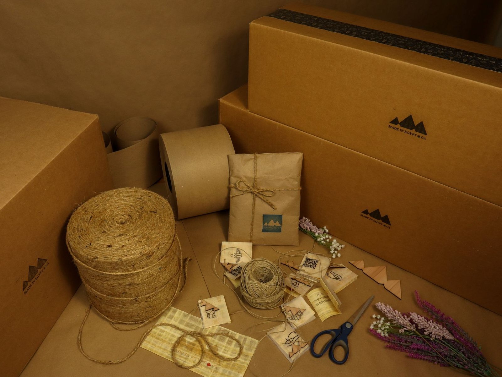
Fig. 01 — Graphic DesignPortland, USA
The challenge
The brand had grown every year except visually: five years of ad-hoc assets, three generations of 'temporary' logos in circulation, and a website no one could connect to the product's actual quality.
Sales was narrating value slide by slide because the public face wasn't doing it — a tax on every deal the team closed.
The approach
We ran identity as strategy-first: positioning workshops, audience language mapping, competitive teardown — the mark arrived only after the argument for it existed on paper.
The system shipped as usable infrastructure: tokens, type scales, layout logic, imagery rules and a component library stress-tested with their worst real content, not our best mock content.
Rollout covered every surface customers actually touch — site, product UI, email, documents, social — sequenced so the launch felt like an upgrade, not a costume change.
- Positioning and messaging workshop with documented outcomes
- Tokenised Figma library mapped to front-end code
- Accessibility pass to WCAG 2.2 AA across all core flows
- Rollout kit: email, documents, social and pitch-deck templates
The results
Their process killed three directions we would have loved — and delivered one we now can't imagine being without.Elena Marsh — Head of Digital, Studio Verde
The gallery
Start a project
Your metric. Our move.
Fixed quotes in 48 hours. Senior team only. Zero hand-offs between disciplines.